New Media Unlocked!
You can now publish on USA TODAY through MarketersMEDIA. That's 142M+ monthly visitors and DR 92 backlinks for every release you publish.
Better reach, better SEO, better credibility.
You can now publish on USA TODAY through MarketersMEDIA. That's 142M+ monthly visitors and DR 92 backlinks for every release you publish.
Better reach, better SEO, better credibility.
Table of Content


New to Facebook ads? Well, you are at the right place.
Having looked over 500+ Facebook Ads, I have realized that there are certain dos and don’ts you have to play by the rulebook in Facebook advertising. And truth be told, these ways and methods are no secrets as they lie in plain sight.
In fact, they are built on the 4 key elements of making a Facebook Ad, which are its image, text, call-to-action button, and of course, a spice of some good ol’ psychological marketing tricks in the value proposition.
But before we proceed, it is important for you to factor in the placement of your Facebook Ad. Will it be on the right-hand column, or is it going to be on the news feed? Also, who are your target audiences? Are they 30 to 40-year-old soccer moms or maybe general couch potatoes?
Anyhow, you have to be aware of irrelevance because it is a downfall for any advertisement. Nevertheless, this can be prevented by crafting a detailed buyer persona and having your ad design cater to them. First and foremost, a picture is worth a thousand words. So…
Visual images speak louder than words, and this has often been the element that carries people off to their la-la land. In any case, it is an essential element that allows Facebook users to visualize and construct mental images in their minds. For example, take a look at Isaiah Mustafa down below,
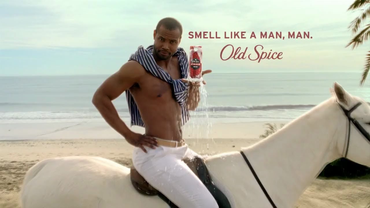
Or maybe you more likely know him as “the Old Spice Guy” or “the Man on a Horse” from the commercial. This is one of the classical metaphor-based advertisements that likely evokes a favorable attitude towards the product.
This is because in this image, while Old Spice is a perfume, it is portrayed beyond that, sending a message that your man may smell like a man if you choose to use the Old Spice product (with an added Prince Charming effect as a bonus). Even for the non-female clientele, it possesses a sense of humor and wittiness which makes the image memorable.
Besides that, image has become ever more vital with Facebook Q3 2015 Results showing that Facebook users have switched to mobile platforms. The report says that in September 2015, 893 million Facebook users accessed their Facebook accounts through their mobile devices. And the numbers keep increasing, with an expected 27% increase annually.
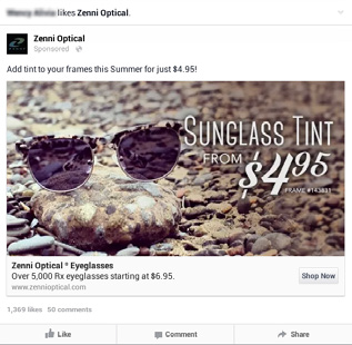
Hence, taking media platform into consideration, a mobile device as compared to a desktop screen is 2 to 3 times smaller in size, which means no teeny-tiny text, as godly written as they are, can attract Facebook users’ attention as compared to a picture of tinted sunglasses sitting on a rock.
But with the intense competition of most advertisements focused on images, as well as the competition of news feed ads with the Facebook user’s own feed of pictures of friends and family. The question lies in how you can create an image that is more eye-catching or more click-inviting?
Here are a few tips on how:
Paying attention to technical specifications is important as you’d not want to have your image resize. In this aspect, Facebook has specific guidelines that you ought to follow.
An image with text is also more effective than an image without text. Because, as far as a picture is worth a thousand words, text enhances an image by steering it in the right direction. But it is best if we do not overdo it. In this sense, I still like to abide by this once-upon-a-time rule on Facebook, which is the 20% text image rule.
Because even though Facebook has lifted the 20% text rule and images with more than 20% overlaid text have received the green light, too much text on an image will make it too busy. Not to mention that the scattered words will distract viewers’ attention from the protagonist of the ad. With no focus point for viewers, they are more likely to just skip the advertisement.
On the other hand, including a brand statement or logo in the advertisement image itself can be useful to promote branding, but remember to do so in a limited space. Going minimalistic is the key to making a successful ad.
In addition, do not miss out on the profile image as well.
As small as it may be, associating a certain image with a product and or service is essential in establishing a brand and even an agenda. Take Rosie the Riveter here, you might not have known who she is, but you most likely have seen her iconic red bandana and flannel shirt. A representation of gender equality, Rosie has become the iconic emblem of feminism.
Similarly, stick to one profile image and have it symbolize your business. Furthermore, branding is important as it is the very reason that people tend to overpay.
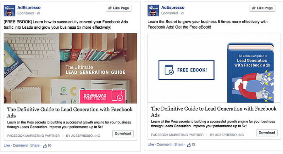
An experiment by AdEspresso has shown that real-life pictures versus illustrations yielded different results in different situations. The test was conducted by split-testing different images of illustrations against real-life images and discovering that they outperformed each other in different scenarios. There were basically two split tests, both of which had real-life images placed against illustrations.
For the first promotion of a lead generation guide, the illustrated ebook on the right, as shown below, got a higher click rate.
Then again, when it comes to a split-test for the 500+ Facebook Ads images, the one with a real-life image got a higher click rate. Though this can also be said to be contributed by the human element.
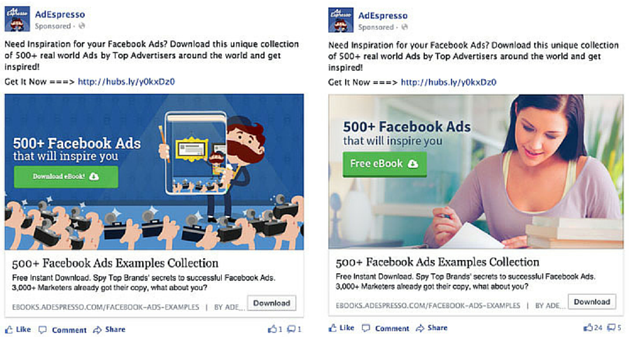
Instead of placing just a picture of your product, why not place an image of people using your product or services? The human element has been said to be one of the must-haves in an effective advertisement image.
The advertisement by FortisBC above shows one of the most effective Facebook advertisements, and the reason lies in the image – A picture of a smiling woman. It does not necessarily have to be an attractive woman, but an image of a woman smiling, looking directly at the camera is said to be most effective in advertising.
You may ask why? The reason is simple, that is because smiling is one of the most positive emotional gestures which can reel in more clicks than anything.
Just imagine Mona Lisa and her smile, which has won international attention.
Also, instead of placing a single image, why not try multiple images?
Multiple images provide more selections and choices to attract buyers. If you are not attracted to this coat in black, you might like it more in brown or blue. In a way, it is similar to the workings of AKB48.
On the plus side, multiple images can also tell a sequential story in advertising, which can attract viewers’ attention.
As for color choices, remember to avoid blue and white as they are the two main color themes of Facebook itself. Also, Canva advises choosing bright and light colors instead of dark colors, the same goes with the filter.
Additionally, images created should be centered on your product or service. As tempting as inserting a surprise element into your images and headlines may be, it may catch the attention of Facebook users. But do remember, in the end, it is not just about the click rates but the sales rates as well.
The superiority of visual images, however, does not mean that text comes second. Instead, words above the image are equally as important. As described above, words serve to further explain the image. For instance, will you understand that Old Spice is a men’s cologne without the words “Smell like a man, man”? This is because words provide clarification and play an essential role in further reinforcing the message of the image.
Besides that, it is ultimately the right choice of words that leads to a buyer’s decision-making in conversion. In this case, you have to take into consideration who you are writing to in order to address their different needs and expectations.
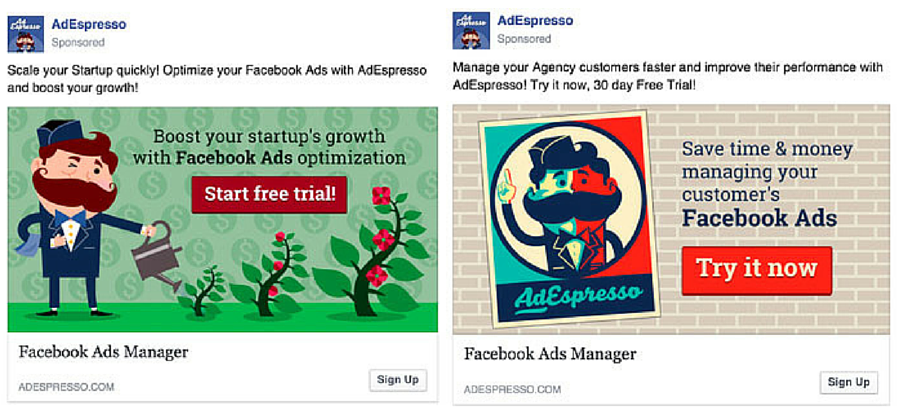
Notice the two different texts above the image, although both promote a Facebook Ads Manager, the text on the right aimed at business startups proposes the value of boosting startup growth. On the other hand, the text on the right aimed at media outlets communicates another benefit of using the Ads Manager, that is the management of agency customers.
However, do keep in mind that Facebook has a standardized rule of 90 text characters. This is one rule you should always follow, so as not to risk truncation, which is…
In other words, this also means that it is important for you to be practice minimalistic writing while being straightforward in addressing your point and to prevent over-decorating your text. Too much unnecessary text causes readers to skim or skip through the text. Besides, the psychology of language says that fewer words build trust.
Even so, if you have written beyond the 90-character text limit, it can still be worked around using ‘Power Editor’, which allows you to include more text. Regardless of the number of words, when you write, do keep in mind that every word carries a different meaning in terms of weight and social or cultural meaning.
Quoting the slogan from one of my favorite books, Animal Farm. George Orwell said that “All animals are equal, but some are more equal than others”. The same principle applies to words as well, with specific words more powerful than others.
For example, using the word now instead of its synonyms ‘immediately’ or ‘this minute’ not only saves you text characters. More importantly, it is short, sweet, and concise.
Also, crawling the web, I have found a 1970 Yale University research that published the 12 most persuasive English words that are said to increase profits, which are: –
“New, discovery, guarantee, you, save, money, easy, health, proven, safety, love, results”
Though the study has later been proven fictitious, in the end, these words still bear importance as they are persuasive in business writing, especially the 5 words of “you, free, instantly, because, and new” further elaborated here by Copyblogger.
Do you like chocolates and free stuff? Well, if you do, you are in for a treat.
Here is a study conducted using chocolates, specifically Lindt truffles and Hershey’s kisses.

The experiment started off with Lindt Truffles sold at 15 cents per piece while Hershey Kisses were sold at 1 cent per piece. While there is a huge difference in price, the much tastier Lindt truffles sold out at a higher percentage of 73%.
At a later stage, the chocolates were sold at a different price, whereby both treats were reduced by 1 cent, wherein Lindt Truffles are now sold at 14 cents while Hershey Kisses are basically free-of-charge. The change in price also caused an unexpected outcome on their sales.
For being free has practically made it priceless, as from the same crowd of people, 69% now chose the Hershey’s Kisses over the Lindt Truffles. This is a result of the zero-price effect, or basically the word “free”.
Though it may be a dumb question, but either way, having read the experiment, I have asked myself, “Why do people like free stuff so much?”
Take this scenario, for example, Lindt Truffles is still tastier and even cheaper at one point, but why do people go for the Kisses?
Well, turns out the answer is relativity as Dan Ariely proposed in his book Predictably Irrational. He explained that relativity is the secret agent in more decisions than we would have realized. To an extent, it has even helped decide whom to date – and ultimately, whom to marry through the ugly friend effect
From a marketing perspective, if you are given the choice to go to Paris or Rome, which would you choose? Given that both choices weigh equal, most will have a hard time choosing, but throw in a free breakfast for the trip to Paris, the choice would be made obvious.
You’re going to Paris.
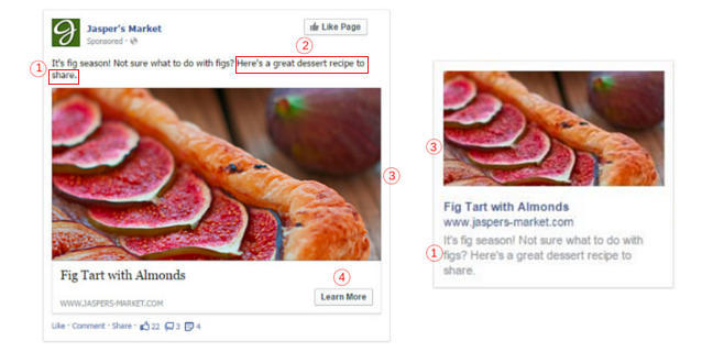
However, do not mistake the value proposition in Facebook advertising for just giving freebies. It can be a message that expresses certain benefits, whether in terms of convenience and affordability. In this case, sharing a great recipe or guidelines for writing is also an example of a value proposition. Last but not least, call-to-action.

For when it comes to inserting a call-to-action button, ‘to include, or not to include – that is the question’. And sadly, there is no definite answer as it varies depending on the objective of your advertisement. That is to say, if it is an announcement, it is not likely that a Call-To-Action button is needed.
Then again, not including a CTA button has been said to be one of the worst Facebook ad mistakes.
Do, however, bear in mind that some CTA buttons tend to work better than others, and those used by top-performing ads are often “Learn More, Shop Now and Sign Up”.
But most importantly, your call-to-action button must meet the expectations of the people. If they have clicked on it expecting to see the new Mercedes SUV, don’t land them on the homepage instead. Show them what they came for.
Yet, regardless of how you design your Facebook ad, the answer to the real success of a Facebook ad is for you to design it based on your target audience. Also, do remember to always stay in an A/B mindset and never stop experimenting with the four elements above. You can find out why and how right here.


 PR playbook to get your brand cited in AI answer
How to check and fix what AI says about your brand
2 minutes checklist to make your PR AI-friendly
PR playbook to get your brand cited in AI answer
How to check and fix what AI says about your brand
2 minutes checklist to make your PR AI-friendly